
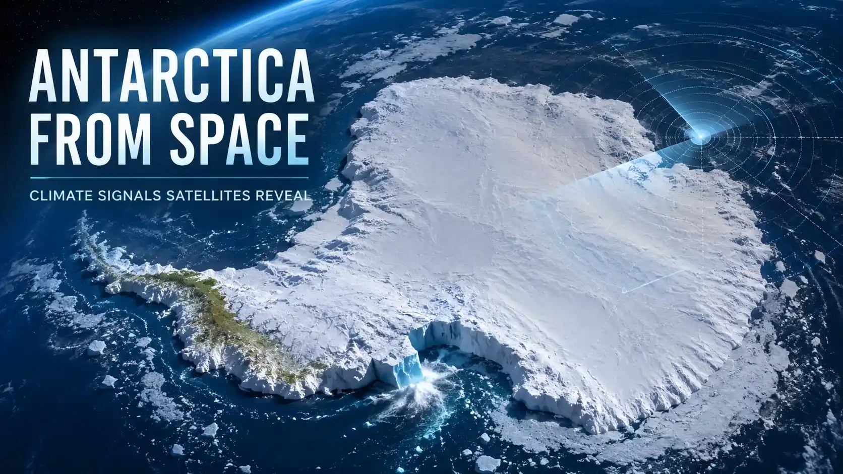
Antarctica from space has changed how we understand the South Pole. What once looked like a quiet white desert now appears as an active climate dashboard, where NASA Earth Observatory, ESA Earth observation, NSIDC sea ice records, and British Antarctic Survey research reveal signals that matter for the entire planet.
This guide explains the Greening of Antarctica, satellite images of Antarctica, sea ice melting, BEDMAP Antarctica mapping, and giant iceberg calving in a simple but science-first way.
- Why Antarctica From Space Matters Now
- How Satellites Read the Frozen Continent
- The Shocking Greening of Antarctica
- Tracking Sea Ice Melting From Orbit
- What Lies Beneath? Antarctica Bedrock Mapping
- Giant Iceberg Calving Caught on Camera
- Common Misconceptions About Antarctica Images
- How Readers Can Explore Antarctica Satellite Images
- How Antarctica Data Improves Climate Models
- Why This Monitoring Matters for the Future
- Conclusion
- Frequently Asked Questions
Why Antarctica From Space Matters Now
Looking at Antarctica from space is not just a visual experience. It is one of the best ways to track a remote continent where fieldwork is difficult, weather is extreme, and the scale is almost impossible to understand from the ground alone.
A single satellite scene can show vegetation changes on the Antarctic Peninsula, sea ice extent, bedrock hidden below ice, and iceberg movement. That makes satellite monitoring a practical tool, not just a beautiful picture gallery.
For students and readers, the biggest advantage is perspective. A glacier that looks still in a photo may be moving, thinning, cracking, or feeding an ice shelf; satellites let scientists compare today’s image with older records and spot patterns that a single visit could miss.
This is also where digital infrastructure matters. Climate scientists depend on open archives, cloud-based data systems, NASA Worldview, Copernicus Data Space, and large-scale platforms similar to the ideas explained in our cloud storage guide.
| 48 years NSIDC’s satellite sea ice record context for 2026 minimum | 27 million km³ Approximate ice volume represented in BAS BEDMAP3 coverage | 40 years A-23A’s long satellite-documented iceberg story |
How Satellites Read the Frozen Continent
Different satellites see Antarctica in different ways. Optical instruments capture photo-like views, radar can work through clouds and darkness, and laser altimeters measure height changes across ice surfaces.
That matters because Antarctica has long periods of darkness, frequent cloud cover, and huge areas with no easy human access. Radar missions, ICESat-2, Landsat, and European Sentinel missions give scientists different layers of evidence instead of relying on one image type.
When people see viral satellite images of Antarctica, they often assume the image tells the whole story. In reality, scientists usually combine image mosaics, surface elevation, radar soundings, sea ice data, and field measurements before drawing serious conclusions.
This is why responsible climate communication matters. Whether the topic is an Ebola outbreak update, a climate claim, or an AI-generated visual, readers need source-based context and not just a dramatic screenshot.
| Official source: Explore Antarctica and Earth science imagery Best synced source for space-based climate visuals. Use this official source card near the introduction because it supports the article’s main idea: satellite imagery turns Antarctica into a visible climate record. Open NASA Earth Observatory |
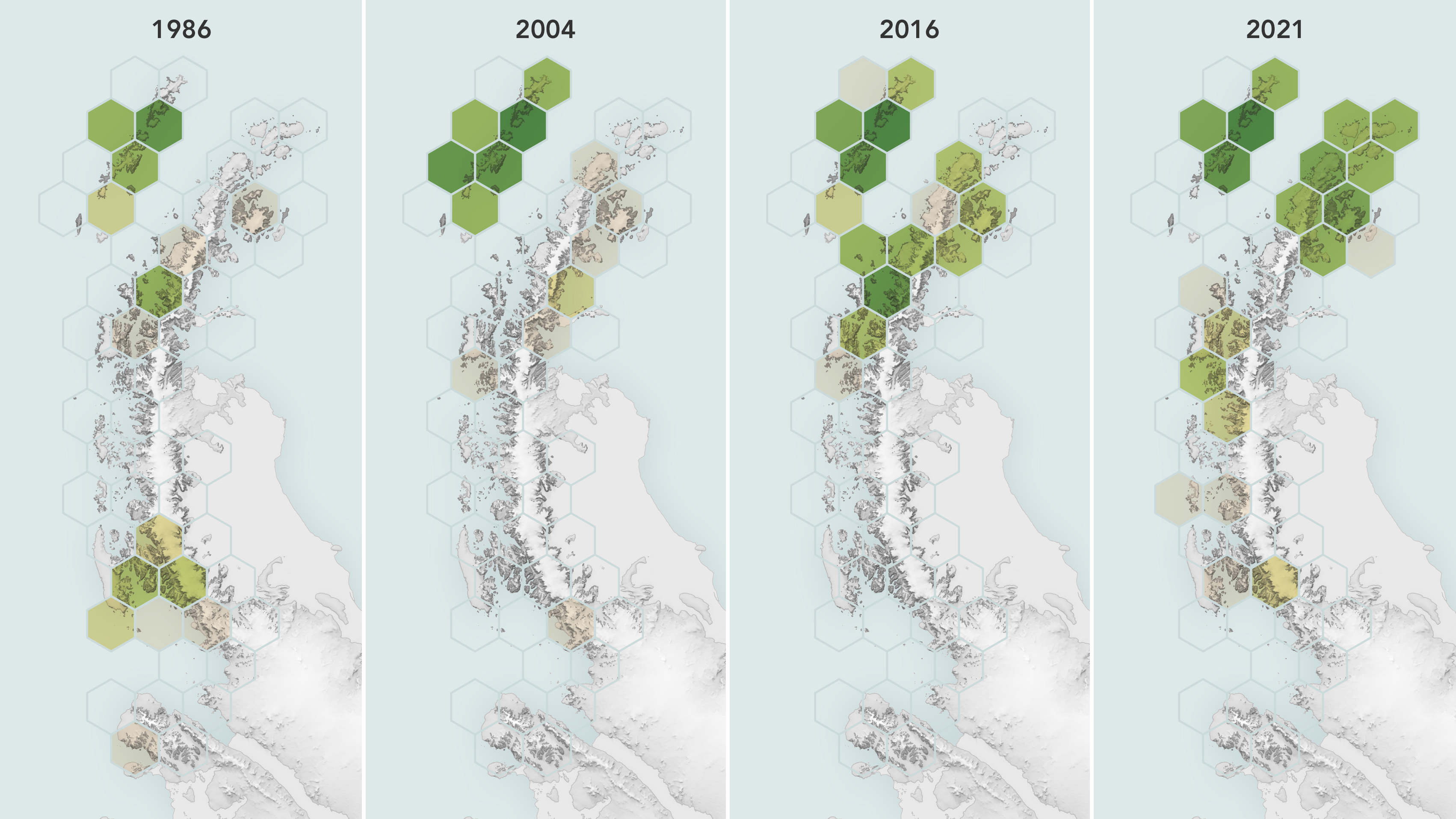
The Shocking Greening of Antarctica
One of the most attention-grabbing discoveries is the Greening of Antarctica. NASA reported that Landsat satellite records showed vegetated land on the Antarctic Peninsula grew from 0.86 to 11.95 square kilometers between 1986 and 2021, with growth accelerating after 2016.
That number may sound small, but the trend is important. Antarctica is still overwhelmingly ice-covered, yet small patches of moss and plant growth can reveal how warming conditions are changing the edges of the continent.
The key point is not that Antarctica is suddenly becoming green everywhere. The real story is that satellite images can detect subtle ecological changes in a place where small shifts may have long-term meaning.
For readers, this is a powerful example of how Antarctica from space makes climate change visible. The change is not only about melting ice; it can also appear as expanding plant life in warmer, ice-free zones.
NASA Earth Observatory / Landsat observations of vegetation change on parts of the Antarctic Peninsula.
Alt text: Antarctica from space satellite images showing Greening of Antarctica on the Antarctic Peninsula
This is also a good place to be careful with wording. Greening does not mean a safe or harmless transformation; it can indicate new ecological pressure, changing habitats, and possible future movement of non-native species.
In a world where AI-generated images can spread quickly, our Generative AI uses and risks guide is relevant here too. Climate visuals should be checked against official sources before being treated as real evidence.
| Official source: NASA: Satellites Reveal a Greener Antarctic Peninsula Best source for the greening section and vegetation data. The NASA article explains how Landsat observations revealed vegetation expansion on the Antarctic Peninsula between 1986 and 2021. Read NASA Greening Story |
Satellites Reveal a Greener Antarctic Peninsula
NASA explains how Landsat satellite records show vegetation expanding on parts of the Antarctic Peninsula from 1986 to 2021.
Read the NASA reportTracking Sea Ice Melting From Orbit
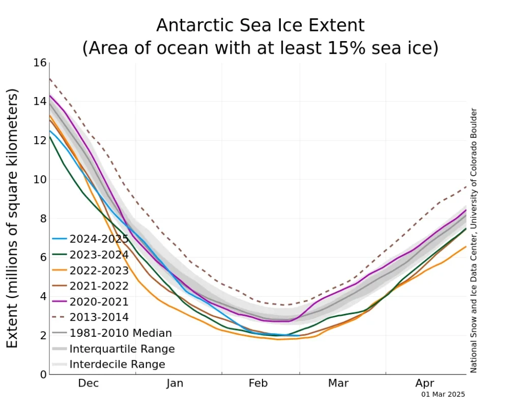
Sea ice is often confused with land ice, but they are not the same. The Antarctic Ice Sheet sits on land, while sea ice forms when ocean water freezes around the continent and then expands or shrinks with the seasons.
Satellites are essential because the sea ice zone is enormous and constantly changing. NSIDC uses satellite records to track Antarctic sea ice extent, concentration, seasonal minimums, and long-term comparisons.
For 2026, NSIDC reported that Antarctic sea ice likely reached its minimum at 2.58 million square kilometers on February 26, ranking sixteenth lowest in the 48-year satellite record. That makes the year noteworthy, but not a simple “everything is fixed” headline.
This is where Antarctica from space becomes especially useful. It lets scientists compare a single season with decades of data, so they can separate normal year-to-year variability from larger climate signals.
NSIDC / NASA Earth Observatory view of Antarctic sea ice around the likely 2026 seasonal minimum.
Alt text: Antarctica from space sea ice melting satellite image from NSIDC 2026
Sea ice also affects sunlight reflection, ocean-atmosphere exchange, and wildlife habitat. When sea ice patterns shift, scientists study possible impacts on ocean circulation, polar ecosystems, and the way Earth absorbs or reflects energy.
That does not mean every low or high year should be turned into panic. A professional climate article should explain the data, link to the source, and avoid overclaiming beyond what the official record supports.
| Official source: NSIDC: Antarctic sea ice reaches near-average minimum Best current source for the sea ice section. This source gives a current, data-based view of Antarctic sea ice extent and explains how 2026 compares with the satellite record. Read NSIDC Update |
What Lies Beneath? Antarctica Bedrock Mapping
From above, Antarctica can look like a smooth white shield. Beneath that ice, however, is a hidden continent of mountains, valleys, basins, canyons, and deep bedrock features that shape how ice moves.
This is where BEDMAP Antarctica research becomes important. The British Antarctic Survey’s BEDMAP3 project combines more than six decades of data from planes, satellites, ships, radar surveys, and even older field routes to map the landscape beneath the ice.
BAS described BEDMAP3 as a way to see the continent as if its roughly 27 million cubic kilometers of ice were removed. That image is powerful because bedrock is not just geography; it controls where ice can flow, slow, retreat, or become unstable.
For climate science students, this section is crucial. Ice models need accurate bedrock and ice-thickness data, because the bottom of the ice sheet can be just as important as the surface shown in visible satellite images.
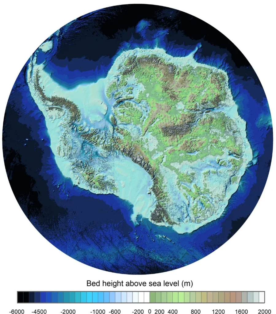
BEDMAP3 also helps make the topic more understandable for general readers. Instead of imagining Antarctica as one flat ice block, readers can picture a buried landscape with ridges, basins, and valleys that influence ice behavior.
This is another reason data handling matters. Mapping a hidden continent requires decades of measurements, careful storage, open access, and analysis tools that let scientists compare millions of observations over time.
| Official source: British Antarctic Survey: New map beneath Antarctica Best source for bedrock mapping and hidden landscape data. This official source explains how BEDMAP3 gives scientists a clearer view of ice thickness, bed topography, and hidden terrain. Read BAS BEDMAP3 |
Giant Iceberg Calving Caught on Camera
Few Antarctic events are as dramatic as giant iceberg calving. When a huge section breaks from an ice shelf, satellites can track the new iceberg from the moment it separates to the time it melts, fragments, or drifts into busy ocean zones.
Iceberg A-23A is one of the clearest recent examples. NASA Earth Observatory documented the long story of the megaberg, including its final fragmentation after a nearly 40-year lifespan tracked by satellites.
The scale is hard to imagine. NASA described A-23A as a massive iceberg that had once been the world’s largest, and later imagery showed blue meltwater ponds and breakup signals as it continued its journey through the Southern Ocean.
Readers understand the story better when it is made relatable. Instead of only saying “hundreds of square kilometers,” explain that a giant iceberg can be comparable to a major city or region, moving like a floating ice island through the ocean.
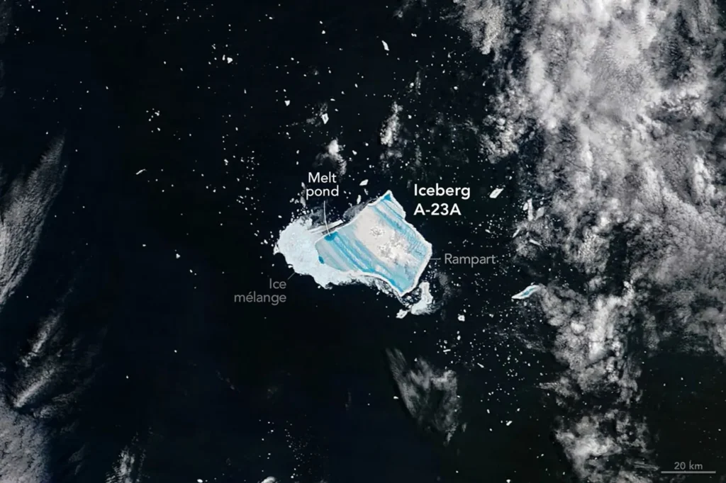
Calving itself is not always unnatural; ice shelves do shed ice. The bigger question is whether warming oceans, changing winds, thinning shelves, or altered glacier flow are changing the timing and behavior of these events.
This is why Antarctica from space matters for public understanding. Satellites can track movement, cracks, meltwater, ocean interaction, and the downstream impact of icebergs long after they leave the coast.
Good science communication is important here too. When a dramatic iceberg story goes viral, readers need expert context, similar to how public risk topics need careful interpretation in our Robert Redfield background guide.
| Official source: NASA: Meltwater turns A-23A blue Best image source for melt ponds and breakup context. View NASA Image Story |
| Official source: NASA: Megaberg ends its long odyssey Best source for A-23A tracking and final fragmentation. Track A-23A Story |
Common Misconceptions About Antarctica Images
The first misconception is that one image proves everything. A single satellite photo can be powerful, but climate science depends on records, repeated measurements, and comparison over time.
The second misconception is that all white areas are land ice. In many views, the white ring around the continent is sea ice, while the continental ice sheet is land-based ice with a very different effect on sea level.
The third misconception is that greening means Antarctica is becoming pleasant or safe. The real concern is ecological disruption, because small changes in a cold environment may indicate deeper shifts in temperature, moisture, and habitat conditions.
The fourth misconception is that every iceberg calving event is automatically proof of climate collapse. Calving is natural, but satellite monitoring helps scientists judge whether frequency, size, location, and surrounding conditions are changing.
| Topic | What readers often think | Better scientific reading |
| Greening | Antarctica is turning green everywhere. | Vegetation has expanded in limited ice-free areas, especially on the Antarctic Peninsula. |
| Sea ice | All Antarctic ice affects sea level the same way. | Sea ice and land ice are different; land ice loss directly affects sea level. |
| BEDMAP | The continent is just a flat block under the ice. | Hidden bedrock includes mountains, valleys, basins, and canyons that influence ice flow. |
| Icebergs | Every calving event has the same cause. | Scientists study location, timing, ocean heat, shelf thinning, and long-term behavior. |
How Readers Can Explore Antarctica Satellite Images
If you want to explore Antarctica from space yourself, start with NASA Earth Observatory. It is easier for general readers because images are paired with plain-language explanations and science context.
For more interactive exploration, NASA Worldview lets users browse recent satellite imagery. It is useful for seeing cloud patterns, sea ice, and large-scale weather systems over the Southern Ocean.
For sea ice data, NSIDC is one of the best public sources. Its updates help readers understand the difference between a dramatic headline and a measured scientific record.
For students who want deeper datasets, Copernicus Data Space and BAS research pages provide a more technical path. Those sources are excellent when you want to study mapping, radar, Sentinel missions, and polar data products.
- NASA Earth Observatory: best for article-friendly images and explainers.
- NASA Worldview: best for browsing current satellite layers.
- NSIDC: best for sea ice charts and cryosphere records.
- BAS BEDMAP: best for hidden bedrock and ice thickness context.
- Copernicus: best for Sentinel data and European Earth observation.
When you use any official image, keep the caption clean and accurate. Do not present NASA, ESA, NSIDC, or BAS visuals as if they endorse your website; simply credit the source and link readers to the original page.
How Antarctica Data Improves Climate Models
Another reason Antarctica from space is so important is climate modeling. A climate model is only as strong as the data behind it, and Antarctica is one of the hardest places on Earth to measure directly.
Satellite observations help fill that gap. They show where ice surfaces are rising or lowering, where glacier flow is speeding up, where sea ice expands or contracts, and where ice shelves are cracking or thinning.
BEDMAP-style bedrock data adds another layer. If scientists know the shape of the ground below the ice, they can better estimate how ice may move when ocean heat, snowfall, surface melt, or glacier speed changes.
This matters beyond science classrooms. Better models can help coastal planners, insurance analysts, port cities, students, and policymakers understand possible sea-level risks without turning every update into a panic headline.
For general readers, the simple takeaway is this: Antarctica is not just being photographed from above. It is being measured, compared, modeled, and rechecked with different instruments so scientists can build a clearer long-term picture.
What satellite data helps scientists compare
- Surface height: whether parts of the ice sheet are gaining or losing elevation.
- Glacier speed: whether ice is moving faster toward the ocean.
- Sea ice extent: how seasonal ice compares with the satellite record.
- Ice shelf stability: where cracks, thinning, and calving may change glacier flow.
- Bedrock shape: how hidden mountains and basins guide ice from below.
This is also why article writers should avoid using only one viral image as proof. A strong explanation connects the image with the dataset, the official source, and the scientific meaning behind the visual.
Why This Monitoring Matters for the Future
Antarctica may feel distant, but its ice is connected to global systems. Ice sheet changes influence sea level, sea ice affects ocean-atmosphere exchange, and polar climate patterns can connect with broader Earth system behavior.
Monitoring Antarctica from space gives humanity a way to see slow changes before they become impossible to ignore. That matters for coastal planning, climate education, shipping, ocean science, and long-term public awareness.
The most important lesson is simple: satellite data makes the invisible visible. It shows hidden bedrock, slow glacier movement, rapid iceberg drift, subtle greening, and changing sea ice in one connected story.
It also makes climate science more transparent for the public. Instead of asking readers to trust vague claims, official satellite programs allow them to see images, read methods, compare dates, and follow the source trail.
For a website like InfoJustify, this is the right publishing angle: explain complex science in simple language, link every major claim to the right source, and make readers feel smarter after finishing the article.
For InfoJustify readers, the best takeaway is not fear. It is informed attention. The more clearly we understand official data, the better we can separate real climate signals from noise, rumors, and misleading viral content.
| Related InfoJustify reading: For readers interested in global-risk monitoring and scientific communication, see Ebola Outbreak 2026 , Robert Redfield , What Is Cloud Storage? , and Generative AI Uses and Risks . |
Conclusion
Antarctica from space reveals a continent that is far more active than it appears from the ground. Satellites show greening land, shifting sea ice, hidden bedrock, and giant iceberg calving with a level of detail that was impossible for earlier generations.
The view is beautiful, but the message is serious. Antarctica is not just a frozen edge of the map; it is part of Earth’s climate system, ocean system, and future sea-level story.
That is why satellite monitoring matters. It helps scientists track change, helps students understand climate science, and helps the public see why the frozen continent deserves attention.
Frequently Asked Questions
What does Antarctica from space show?
Antarctica from space shows the ice sheet, sea ice, glaciers, ice shelves, hidden bedrock clues, iceberg movement, and greening on parts of the Antarctic Peninsula.
Why is the Greening of Antarctica important?
The Greening of Antarctica is important because expanding moss and plant life on the Antarctic Peninsula may reveal ecological change linked to warming conditions.
How do satellites track sea ice melting around Antarctica?
Satellites track sea ice by measuring extent, concentration, height, and seasonal change. NSIDC and NASA use long-term satellite records to compare each year with past decades.
What is BEDMAP Antarctica?
BEDMAP Antarctica refers to mapping projects that combine radar, satellite, and survey data to show ice thickness and the hidden bedrock landscape beneath Antarctica.
Are giant iceberg calving events caused only by global warming?
No. Iceberg calving can be natural, but satellites help scientists study whether warming oceans, shelf thinning, glacier speed, or long-term climate patterns are changing these events.
- Antarctica From Space: 5 Climate Signals to Watch
- Are AI voices safe for YouTube monetization
- Realistic Indian Accent AI Voices for Free: 3 Best Tools
- ElevenLabs Free Alternatives for Emotional Voices: 3 Picks
- Best Free AI Voice Generators for Faceless YouTube Shorts
- Top 5 Free AI Voice Generator Realistic Tools
- Free AI Video Generators Without Watermark: 2026 Truth
- AI vs Machine Learning: Powerful 2026 Career Truth
- Generative AI Uses and Risks: 11 Real-Life Lessons for Beginners
- What is Generative AI? 12 Powerful Basics for Beginners
- What is AI? 11 Powerful Basics Every Beginner Should Know